Robeco.nl - Corporate website optimisations

Picture 1 of 6 - Re-designed Robeco.nl News Page with various options to present the content.

Picture 2 of 6 - Version B - Youwe.nl - Corporate website re-design 

Picture 3 of 7 - Re-designed Fund Selector Page where investors can select the funds they wish to invest in. I focused mainly on the navigation and the way the large amount of content is presented.

Picture 4 of 7 - Re-design of the Robeco E-mail templates. 

Picture 5 of 7 - Re-design of the page where 'saving' is compared to 'investing'. 

Picture 6 of 7 - A re-design of the 'Deposit'-flow where investors can deposit money onto their accounts. 

Since June 2016 I have been working as a Freelance UX/UI and Visual Designer at Robeco Institutional Asset Management. Mainly as part of a small but dedicated team of various disciplines responsible for the online marketing and website optimisation of Robeco.nl and Robeco.com.

Disclaimer:
The screens shown on this portfolio page are my designs. They do not represent actual online pages.

Robeco

Robeco is a top asset manager with more than 85 years of experience in fund investing, with their headquarters in Rotterdam, the Netherlands. Their clients range from private individuals and companies to institutional investors, such as pension funds.

Their investors are active in Rotterdam, Chicago, Paris, Zurich, Boston, New York, Mumbai and Hong Kong.

Challenge

When I started, Robeco's website wasn't updated much in the past years. A small team was set up and is still responsible for the e-commerce acquisition and retention optimisations on Robeco.nl.

UX/UI & Visual Design

I provide UX/UI and Visual Design services, designing small blocks, full webpages and several user flows. I have been re-designing the existing News Page, Mobile App, Deposit Flow, E-mail templates, the Fund Selector and numerous online marketing pages. 

The small team I am part of, consists of online marketeers, a copywriter, a Interaction Designer and we work closely with Content Managers and in-house Front-end en Back-end developers. 

Illustration Services

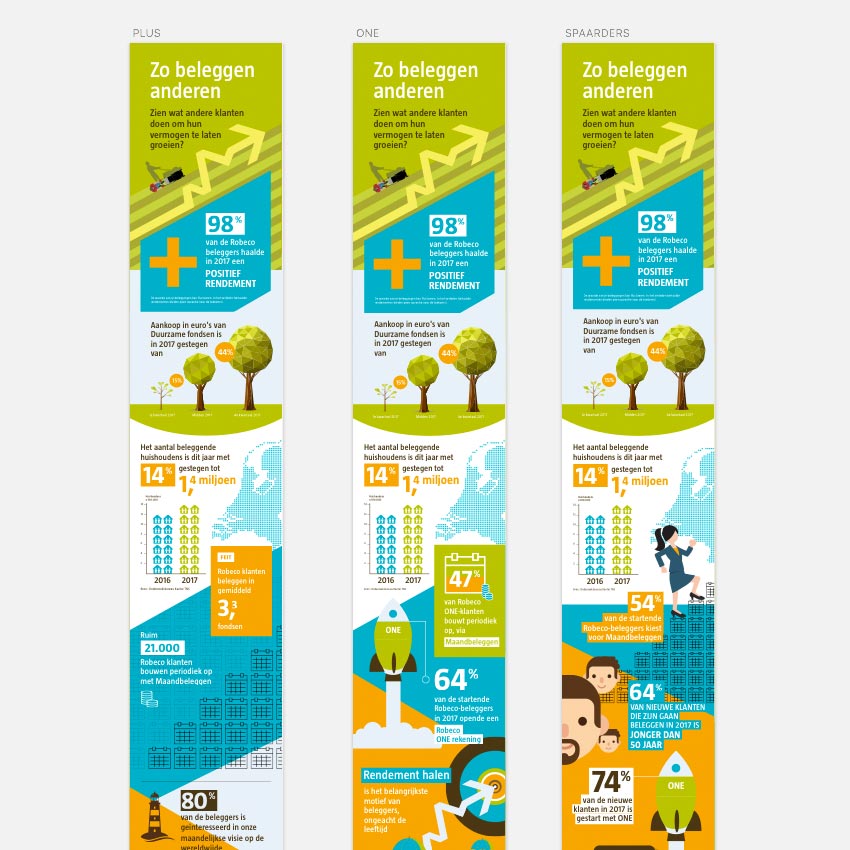
Besides Visual and UX/Ui Webdesign I was asked to provide illustration services, specifically for the illustration / design of various infographics.


How can I help you?

Do you need professional Visual Web / Interface Designs for your own project or brand? Or do you have any questions regarding this particular project or my current availability and services as a Freelance Visual Designer? I'd love to help you. Please find my contact details in the footer of this website. 


Other Web Interface design projects

BLOG // DESIGN & ILLUSTRATION

BLOG // ART

BLOG // INTERIOR & STYLING

BLOG // PERSONAL


Corporate website designs for web agency Youwe.nl

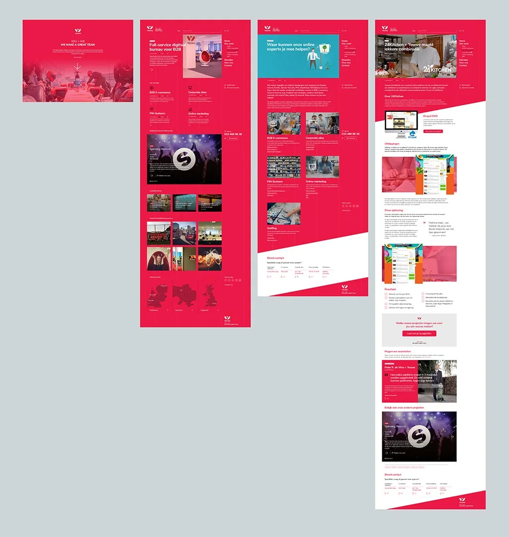
Picture 1 of 7 - Version A - Youwe.nl - Corporate website re-design 

Picture 2 of 7 - Version B - Youwe.nl - Corporate website re-design 

Picture 3 of 7 - Version A - HOMEPAGE WITH MOBILE, RESPONSIVE DESIGNS - Youwe.nl - Corporate website re-design

Picture 4 of 7 - CASE DETAIL PAGE WITH MOBILE, RESPONSIVE DESIGN - Youwe.nl - Corporate website re-design

Picture 5 of 7 - ONLINE MARKETING PAGE WITH MOBILE, RESPONSIVE VERSION - Youwe.nl - Corporate website re-design

Picture 6 of 7 - NEWS PAGE WITH MOBILE, RESPONSIVE VERSION - Youwe.nl - Corporate website re-design

Picture 7 of 7 - JOB OPENING DETAIL PAGE WITH MOBILE, RESPONSIVE VERSION - Youwe.nl - Corporate website re-design

Youwe is a full service internet agency based in Rotterdam (NL), Groningen (NL), Amsterdam (NL), Kiev (Russia) and London (GB). They have a strong focus on providing Magento e-commerce related services.

Since 2000, they have been working for clients like Grolsch, Heidelberg, SNS Bank, 24Kitchen, Spinning Records, PPG and the Dutch postal company Postnl.

Design brief
Rob Wiek contacted me with a simple brief; 'Provide us with a few re-designed pages of our corporate website Youwe.nl. Don't bother redesigning content.'

Design solution and Art Direction
I designed two versions, both based on Youwes existing brand guidelines. 

Version 1 has a more traditional look&feel but with a lot of whitespace and well-balanced graphic elements. I also suggested a change in the typography to get a more consistent look channel-wide. 

Version 2 used a more bold approach and freedom towards the current brand style. 

Youwe choose to continue with Phase 2 with the Version 1 designs. 

All webdesigns where made with Adobe Photoshop and with the Mobile First methodology in mind, where mobile designs where designed prior to the desktop version.

Although this usually is used because of the advantages in content presentation and sanitation (not part of this project), I used it primarily to make focus on great mobile website design. 


How can I help you?

Do you need professional Visual Web / Interface Designs for your own project or brand? Or do you have any questions regarding this particular project or my current availability and services as a Freelance Visual Designer? I'd love to help you. Please find my contact details in the footer of this website. 


Other Web Interface design projects

BLOG // DESIGN & ILLUSTRATION

BLOG // ART

BLOG // INTERIOR & STYLING

BLOG // PERSONAL


Knorr.nl redesign website food brand Unilever

Picture 1 of 2 - Full webpage design for MailingCube CRM Software

Picture 2 of 2 - Introduction and index of the MailingCube CRM Software website

Rotterdam based Dutch Advertising Agency Emakina (formerly known as Suntzu) asked Dutch Freelance Senior Designer Michiel Nagtegaal to re-design the website of Knorr. 

Knorr is one of many food brands by Dutch multinational Unilever. By the time Michiel was asked to revive the online design, the old Knorr website consisted of content in small boxes and no tasty food photography.

Design brief
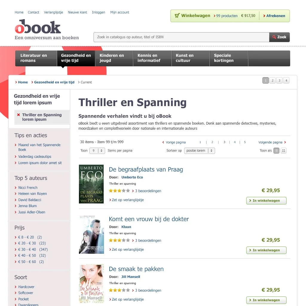
An important part of the design brief was to combine the extensive amount of content with the new provided food photography. 

Design solution and Art Direction
In contrast to the straight square boxes a dynamic swoosh was introduced, to respectfully show the product photography. Content becomes more and more important the more deeper a visitor comes in a website. So the vertical 'topvisual' becomes less wide, to make room for the content.


How can I help you?

Do you need professional Visual Web / Interface Designs for your own project or brand? Or do you have any questions regarding this particular project or my current availability and services as a Freelance Visual Designer? I'd love to help you. Please find my contact details in the footer of this website. 


Other Web Interface design projects

BLOG // DESIGN & ILLUSTRATION

BLOG // ART

BLOG // INTERIOR & STYLING

BLOG // PERSONAL


Telfort.nl visual design 'Internet & Calling'-webpages

Picture 1 of 4 - Re-designed 'Internet, TV & Bellen' sub-homepage on the Telfort.nl webshop

Picture 2 of 4 - Re-designed Telfort.nl 'Shop'-page

Picture 3 of 4 - Re-designed Telfort.nl 'Interactive TV' page

Picture 4 of 4 - Re-designed Telfort.nl 'HBO' page

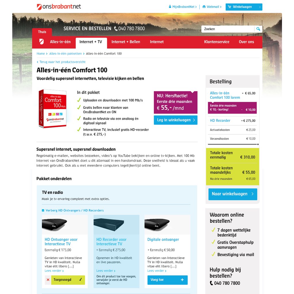
In juli 2015 I was asked by Telfort to deliver visual designs for a few pages for the part of the Telfort webshop that informs customers on the ‘Internet + Calling’ proposition. 

Part of the briefing was to bring a more spectaculair and contemporary look & feel in the page designs. While staying within the boundaries of the Telfort corporate brand style guidelines. 

The Telfort pages are visible at: 
http://bit.ly/1SVn285


How can I help you?

Do you need professional Visual Web / Interface Designs for your own project or brand? Or do you have any questions regarding this particular project or my current availability and services as a Freelance Visual Designer? I'd love to help you. Please find my contact details in the footer of this website. 


Other Web Interface design projects


BLOG // DESIGN & ILLUSTRATION

BLOG // ART

BLOG // INTERIOR & STYLING

BLOG // PERSONAL


Freelance Visual and UX/UI Design for KPN from 2007 till 2015

Picture 1 of 12 - Re-designed Product Detail Page for Mobile Phones with the Product Shot on the left and partly above a topheader image

Picture 2 of 12 - Re-designed KPN.com Blog Homepage with tiles

Picture 3 of 12 - One of the less recent Mobile Plan Select Pages with a lot of visual cues to the product selection

Picture 4 of 12 - Another re-designed Mobile Plan Select Page 

Picture 5 of 12 - Mobile Phone Overview Page with a visual rhythm in the tiles with product presentations

Picture 6 of 12 - Blog Category Page of the KPN Blog

Picture 7 of 12 - Various KPN TV Plans on this Plan Select Page with a topheader partly incorporated

Picture 8 of 12 - A Campagne (XL Deals) Overview Page with a visual gimmick incorporated

Picture 9 of 12 - Re-designed Product Packaging and Product Icons

Picture 10 of 12 - Experimental mockup of a Interactive TV Landing Page as part of research on webpages with more 'experience'

Picture 11 of 12 - Design for an 'Online Deal'-flag / label on the product presentation of mobile phones.

Picture 12 of 12 - A greyscale mockup of a new Mobile Phones Overview Page with interactive tiles

From 2007 until 2015 I was fortunate to be asked by KPN, as a Freelance Senior Visual Designer, Art Director and Interaction Designer to do numerous design projects and supporting various teams within the KPN Online Department. 

In those roles I successfully (re)designed the main customer flow in the webshop multiple times. I was consulted and advised on design, communication and interaction issues, from the orientation pages higher in the webshop to the deepest page in the Checkout Flow.

2014-2015
Before I took the initiative to shift my focus onto other clients in March 2015, the main projects I successfully delivered where:

  • Online introduction of the Apple iPhone 6
  • Enhancing and re-designing the main flow in the mobile phone online shop
  • Introduction and support of the new KPN Online Brand Style overhaul
  • Transition towards the KPN brand and phase-out designs of the Hi brand,
  • Re-designing the KPN Forum and KPN Blog

How can I help you?

Do you need professional Visual Web / Interface Designs for your own project or brand? Or do you have any questions regarding this particular project or my current availability and services as a Freelance Visual Designer? I'd love to help you. Please find my contact details in the footer of this website. 


Other Web Interface design projects

BLOG // DESIGN & ILLUSTRATION

BLOG // ART

BLOG // INTERIOR & STYLING

BLOG // PERSONAL


Re-design of the O'Neill.com webshop selling surf-, ski- and snowboard clothing

Picture 1 of 8 - Darker version of a re-design proposal of the O'Neill.com global homepage

Picture 2 of 8 - Alternative, more lighter, design of the O'Neill.com homepage

Picture 3 of 8 - Darker version of a re-designed homepage of the webshop O'Neill.com without the large homepage slider

Picture 4 of 8 - Re-design of the 'New Arrivals' sub-homepage of the O'Neill.comwebshop 

Picture 5 of 8 - A re-designed Product Detail Page of the O'Neill.com homepage

Picture 6 of 8 - We re-designed also the Shopping Basket webpage in the same style as the rest of the re-designed pages

Picture 7 of 8 - A visual design for the login modal with login form and error message

I was asked by BizzMagic to deliver Functional, Interaction and Visual Designs for the re-design of the global O'Neill webshop, selling surf, ski and snowboard apparel.


How can I help you?

Do you need professional Visual Web / Interface Designs for your own project or brand? Or do you have any questions regarding this particular project or my current availability and services as a Freelance Visual Designer? I'd love to help you. Please find my contact details in the footer of this website. 


Other Web Interface design projects


BLOG // DESIGN & ILLUSTRATION

BLOG // ART

BLOG // INTERIOR & STYLING

BLOG // PERSONAL