OnsBrabantNet is an internet, television and phone provider based in Eindhoven, the Netherlands. OnsBrabantNet focusses on the local regions Brabant and Limburg. Since 2012 OnsBrabantNet has been part of one of the Dutch largest telecommunications providers KPN.
KPN
From 2007 till 2015 I worked as a Freelance UX/UI and Visual Designer for KPN on several departments, including Online Sales. This department is responsible for the webshop selling (mobile) phones, internet and phone plans.
Extensive experience
My extensive experience with large e-commerce environments and Dutch telecommunications brands like KPN, T-Mobile, Hi and Telfort was one of the main reasons for the people at OnsBrabantNet to ask me to provide UX/UI and Visual Design services.
I worked in a small dedicated team, with a front-end developer, content managers, a online marketing professional and a project manager. The brand style guidelines where loose which gave us a lot of freedom redesigning the webshop.
Enhance online conversion
The main goal was to enhance the online conversion. A lot of visitors dropped out early in the ordering process, so we first focussed on some 'quick wins' while designing a complete new ordering and checkout process. Forms, Product Detail Pages, Product Overview Pages and the Shopping Cart Page were intensively examined and re-designed.
The old website before redesign
OnsBrabantNet redesign - Picture 1 of 11 - The old homepage before redesign
OnsBrabantNet redesign - Picture 2 of 11 - One of the old Product Overview Pages
OnsBrabantNet redesign - Picture 3 of 11 - Part of the old Checkout
The proposed redesign
OnsBrabantNet redesign - Picture 4 of 11 - Above in grey the site structure / flow chart of the old website and the proposed simplified site structure of the new webshop.

OnsBrabantNet redesign - Picture 5 of 11 - By subdividing the website into site levels, a clear layer structure was created that provided tools for determining where specific content should be placed.
Visual designs of the new website / webshop

OnsBrabantNet redesign - Picture 6 of 11 - Redesigned homepage
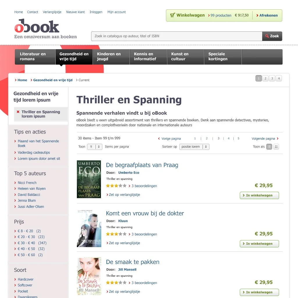
OnsBrabantNet redesign - Picture 7 of 11 - Redesigned Product Overview Page
OnsBrabantNet redesign - Picture 8 of 11 - Redesigned Product Detail Page
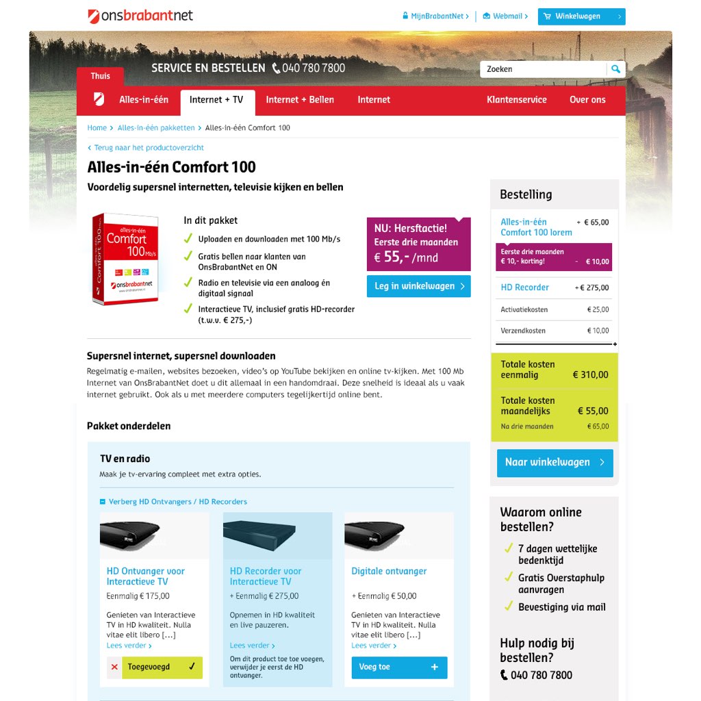
OnsBrabantNet redesign - Picture 9 of 11 - Redesigned Shopping Cart
How can I help you?
Do you need professional Visual Web / Interface Designs for your own project or brand? Or do you have any questions regarding this particular project or my current availability and services as a Freelance Visual Designer? I'd love to help you. Please find my contact details in the footer of this website.
OnsBrabantNet redesign - Picture 10 of 11 - Redesigned Checkout form
OnsBrabantNet redesign - Picture 11 of 11 - Redesigned Order Overview Page
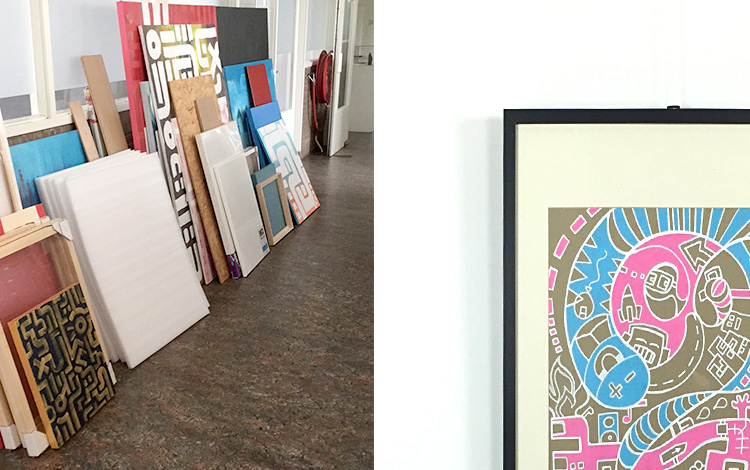
Other Web Interface design projects


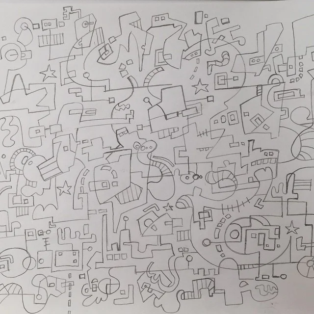
BLOG // DESIGN & ILLUSTRATION


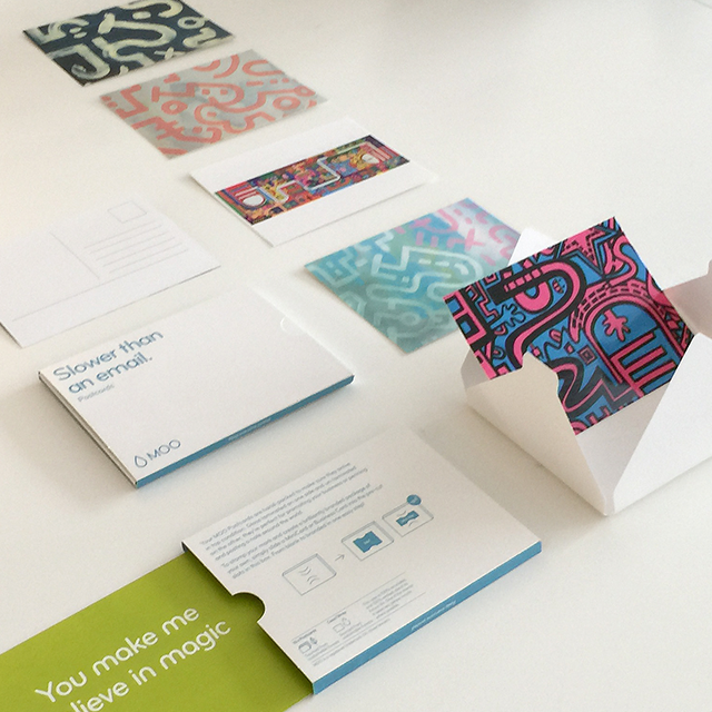

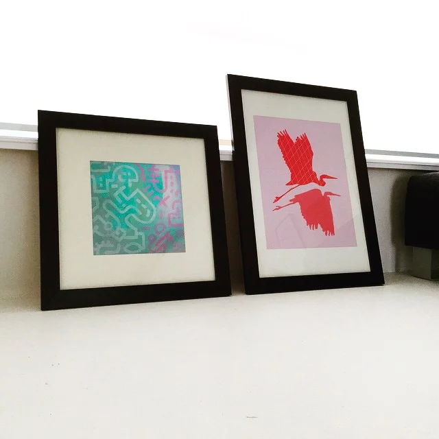


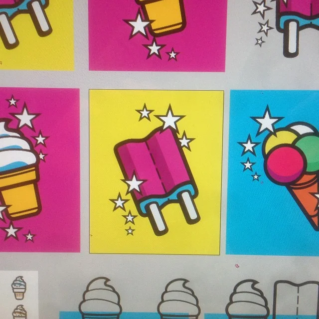

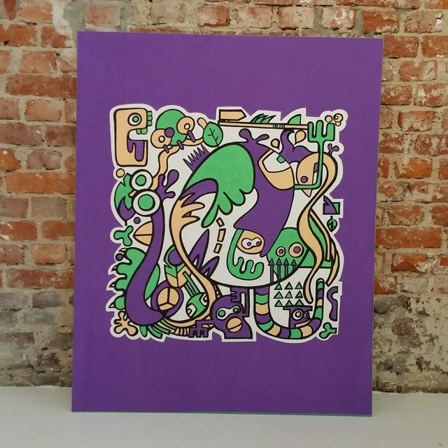


BLOG // ART


BLOG // INTERIOR & STYLING


BLOG // PERSONAL