Freelance Visual and UX/UI Design for KPN from 2007 till 2015

Picture 1 of 12 - Re-designed Product Detail Page for Mobile Phones with the Product Shot on the left and partly above a topheader image

Picture 2 of 12 - Re-designed KPN.com Blog Homepage with tiles

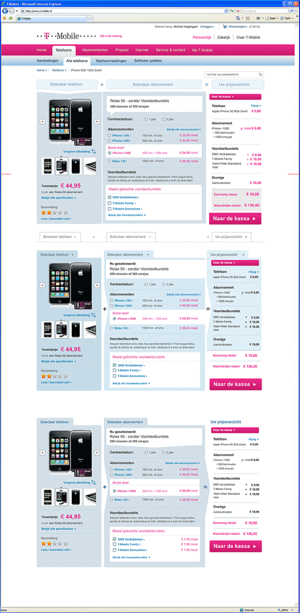
Picture 3 of 12 - One of the less recent Mobile Plan Select Pages with a lot of visual cues to the product selection

Picture 4 of 12 - Another re-designed Mobile Plan Select Page 

Picture 5 of 12 - Mobile Phone Overview Page with a visual rhythm in the tiles with product presentations

Picture 6 of 12 - Blog Category Page of the KPN Blog

Picture 7 of 12 - Various KPN TV Plans on this Plan Select Page with a topheader partly incorporated

Picture 8 of 12 - A Campagne (XL Deals) Overview Page with a visual gimmick incorporated

Picture 9 of 12 - Re-designed Product Packaging and Product Icons

Picture 10 of 12 - Experimental mockup of a Interactive TV Landing Page as part of research on webpages with more 'experience'

Picture 11 of 12 - Design for an 'Online Deal'-flag / label on the product presentation of mobile phones.

Picture 12 of 12 - A greyscale mockup of a new Mobile Phones Overview Page with interactive tiles

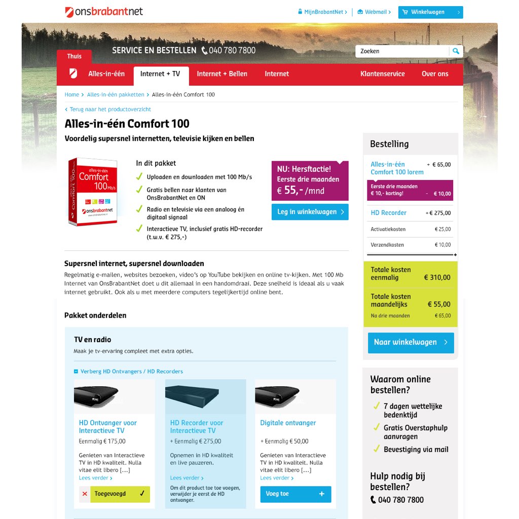
From 2007 until 2015 I was fortunate to be asked by KPN, as a Freelance Senior Visual Designer, Art Director and Interaction Designer to do numerous design projects and supporting various teams within the KPN Online Department. 

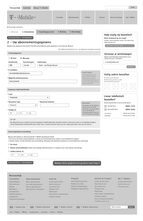
In those roles I successfully (re)designed the main customer flow in the webshop multiple times. I was consulted and advised on design, communication and interaction issues, from the orientation pages higher in the webshop to the deepest page in the Checkout Flow.

2014-2015
Before I took the initiative to shift my focus onto other clients in March 2015, the main projects I successfully delivered where:

  • Online introduction of the Apple iPhone 6
  • Enhancing and re-designing the main flow in the mobile phone online shop
  • Introduction and support of the new KPN Online Brand Style overhaul
  • Transition towards the KPN brand and phase-out designs of the Hi brand,
  • Re-designing the KPN Forum and KPN Blog

How can I help you?

Do you need professional Visual Web / Interface Designs for your own project or brand? Or do you have any questions regarding this particular project or my current availability and services as a Freelance Visual Designer? I'd love to help you. Please find my contact details in the footer of this website. 


Other Web Interface design projects


BLOG // DESIGN & ILLUSTRATION

BLOG // ART

BLOG // INTERIOR & STYLING

BLOG // PERSONAL


UX/UI Design T-Mobile.nl Webshop / Corporate Website Design

Picture 1 of 8 - One of the variants of the T-Mobile.nl homepage

Picture 2 of 8 - A few of the proposals for a better site wide navigation

Picture 3 of 8 - A few of the proposals for a better site wide navigation

Picture 4 of 8 - A few re-designs of the Product Detail Page for mobile phones

Picture 5 of 8 - The Order Form page

Picture 6 of 8 - Greyscale quick mockup for the T-Mobile.nl homepage

Picture 7 of 8 - Greyscale quick mockup for the T-Mobile.nl Product Overview Page

Picture 8 of 8 - Greyscale quick mockup for the T-Mobile.nl Order Form Page

Early 2010 the main webshop of T-Mobile Netherlands was more than five years old. The need for a re-design was obvious. At that time, Senior Project Manager and owner of creative agency Conceptenzo, Roy Nikkelen had just successfully finished a major website re-design of KPN.com, one of the major Dutch telecommunication providers.

As a Freelance Online Designer I was part of Roy Nikkelen's small team that was responsible for the overhaul of the large KPN.com website.

Because of the nice and successfull cooperation on the project, Roy Nikkelen asked me to be part of the team that would re-design the T-Mobile.nl webshop. My role was to bring senior level Visual Design and specific Interaction Design knowledge into the team.

The brief
The briefing from T-Mobile to Conceptenzo was simple. Make the T-Mobile.nl website fresh and contemporary again. The old website frequently used borders, little white space and relatively small margins to communicate their content. That resulted in a boxed, limited and contained look and feel.

Testing proofed that users liked the way the site worked functionally and technically. As a result we focussed on Interaction and Visual Design to further enhance to user experience.

Solution / Art Direction
I envisioned a lighter and more spacious webshop. This is achieved by avoiding boxes, using more white space and margins around graphical elements and widening the header image. The presentation of content became much clearer, structured and without distraction.

Soon after the start of the project, the team recieved word that a new T-Mobile logo needed to be incorporated in the designs. 

Solution / Functional Design
During the tests of the mock-ups it became clear that also the site map needed an update. By making a Functional and Interaction Design of a few of the most used pages (see the greyscale screens), navigational issues and issues with the location of information quickly became clear.

One the solutions was to introduce Sub-Homepages (Plaza's) to guide the visitor towards more in-depth information. Also the Checkout Process was rigorously changed. 


How can I help you?

Do you need professional Visual Web / Interface Designs for your own project or brand? Or do you have any questions regarding this particular project or my current availability and services as a Freelance Visual Designer? I'd love to help you. Please find my contact details in the footer of this website. 


Other Web Interface design projects


BLOG // DESIGN & ILLUSTRATION

BLOG // ART

BLOG // INTERIOR & STYLING

BLOG // PERSONAL