Supershift - Final logo
In 2000, during the rise of the internet, me and Marc Molenwijk founded Dutch web agency Suburban Media. With Marc in the role of ambitious Web Developer and me as a creative Designer, we where able to grow a successful business in designing and developing websites.
Later on, when partner Koen Borgman joined us, we changed the name to Supershift. A name aptly chosen because the business almost instantly shifted in the highest gear to even larger clients and several staff was quickly added to the team.
I left the company in 2007 to pursue other creative dreams but to this day Marc and Koen have been true to the original ambitions and have been growing the business ever since.
The icon stands for the ambition to deliver the best possible solutions. The extra bold typography represents the solid service and heavy weight talents in the Supershift team.
How can I help you?
Do you need an identity design or logo design for your own project or brand? Or do you have any questions regarding this particular project, my current availability or about my services as a logo designer? I'd love to help you. Please find my contact details in the footer of this website.
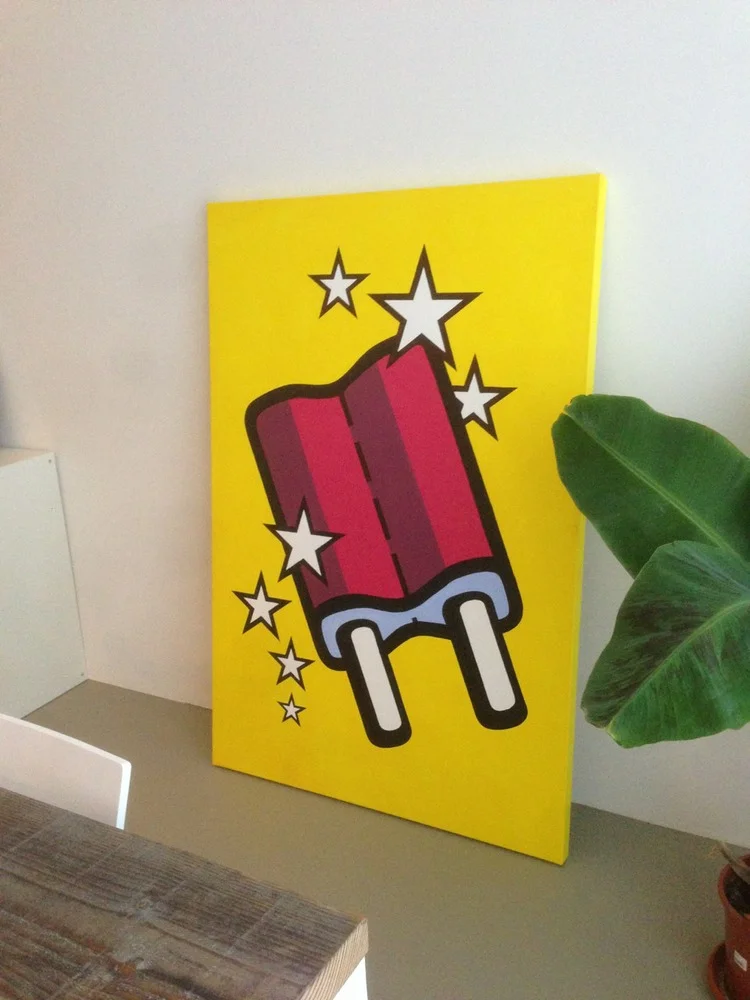
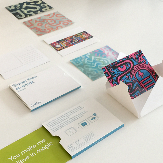
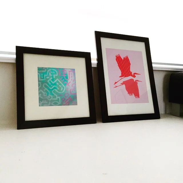
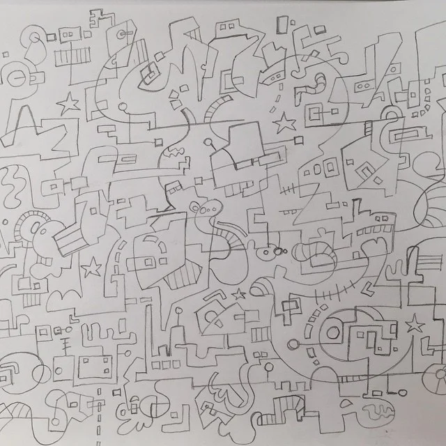
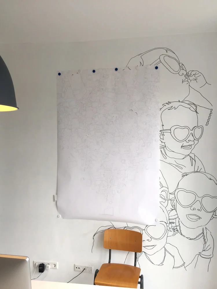
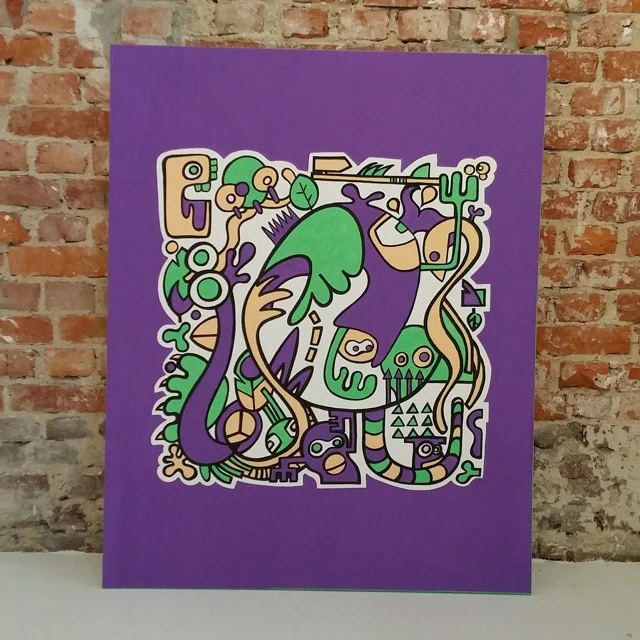
Also check out these illustrations


BLOG // DESIGN & ILLUSTRATION


BLOG // ART


BLOG // INTERIOR & STYLING


BLOG // PERSONAL