As a Dutch Freelance Designer my native language is Dutch. Writing in English is just a little bit more difficult and slow but luckily there are a lot of good blogposts out there that I can refer too. E.g. this morning I came across this nice blogpost by Logogarden.com explaining the difference between the English terms 'Wordmark', 'Lettermark' or 'Brandmark'.
Logogarden is a logo generating service. Advertising with the payoff 'LogoGarden’s free logo generator makes it as easy as 1-2-3'. Which, in a way is the opposite of letting a professional logo designer be creative with your business and after a week or two coming up with a truly unique identity. But I certainly can understand that sometimes its perfectly fine to buy a 'fast food' logo at online services like Logogarden.
The following blogpost appeared on Logogarden.com, on March 25, 2012 and was written by Tom Feary. It thought it might be useful to you and like to make sure it stays available in case Logogarden ceases to excist. If you prefer the original blogpost, you'll find it here.
Creating a Logo – Wordmark, Lettermark, or Brandmark?
When you’re creating a logo to represent your brand or business, you need to make a very important decision up front. Will your logo design be a wordmark, a lettermark, a brand mark, or a combination of these design choices? Before you can make that decision, you need to know what each of these logo design terms mean. Here are some easy-to-understand explanations to help you.
The Three Main Types of Logo Design
Wordmark Logo Design
A wordmark logo is made up of text (typically the brand or business name) in a specific font. The text could be designed using a custom font or a tweaked familiar font. For example, for many years, the AT&T corporate typeface was AT&T Garamond, which was a tweaked version of the popular Garamond font. That font was used in the company’s logo design and was an integral part of its brand identity.
Creating a logo as a wordmark is a good choice for companies and brands with names that clearly communicate what the company or brand offers to consumers since there is no icon included with the logo to give any additional insight into what the company does or the brand promises. Wordmark logo designs can also be used when a well-known company or brand is rebranding with a new logo and brand identity.

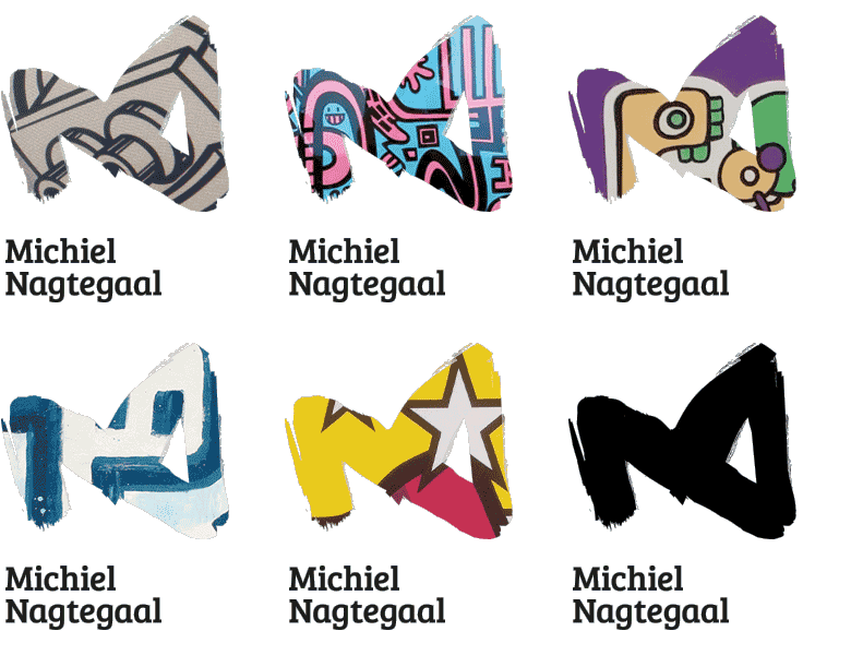
The logo of V&A Advocaten is an example of a lettermark, where the characters form unique shapes.
Lettermark Logo Design
A lettermark logo uses text to create a unique typographic mark. For example, a company might use its initials in a unique design as its logo. Those letters become the brand icon. Lettermark logos are very popular in rebranding campaigns for companies with names that have been shortened to acronyms over the years. The Associated Press logo is a good example.
If you’re thinking of creating a logo as a lettermark, make sure the initials in the logo are a better representation of your company or brand than the full name is. You might need to invest additional time and money into educating consumers about what your company does or brand offers if you choose to use a lettermark logo design, because it might not be as clear as your complete company or brand name is. Also, make sure the initials look good together and can’t be misread or misinterpreted.
Brandmark Logo Design
A brandmark logo uses an icon or symbol with or without the company or brand name. Brandmark logos are popular with companies of all sizes and in all industries because images are often more memorable than words or letters. An icon or symbol can also help to communicate additional information about your company or brand, particularly when your company or brand name doesn’t offer enough details about what you do.
It takes time to raise recognition and increase recall for a brandmark, but for companies that do it successfully, the icon can become a valuable company asset with deep brand equity. For example, brands like Nike, Playboy, and Starbucks don’t need to include a name with their logos at all because their brand icons are so well known. Those icons mean something to consumers.

A short overview of the logo design process behind the Designia logo
Combination Logo Design
Many logos use a combination of wordmark, lettermark, and brandmark elements. The trick to creating a logo with a combination of elements is to make sure the elements work well together without becoming too cluttered. Combination logos that use a wordmark and brand icon or a lettermark and brand icon are very common and you can find them in all industries.
Combination logo designs are popular for companies and brands that are new and trying to communicate key information through their logos. They can’t afford to take the time to educate people about what their company or brand does, so they try to communicate as much as they can through a combination logo design.
This might be interesting too:
BLOG // DESIGN & ILLUSTRATION
