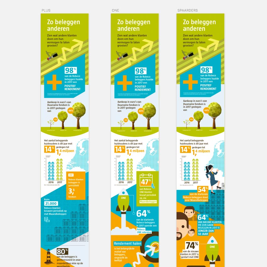
In December 2017 is was asked by Robeco to design three variations of a new Infographic. The Infographic called 'Zo beleggen anderen' ('This is how other invest'), shows a visual representation of numbers and data on how Robeco clients (investors) where investing successfully in 2017.
The three illustrations shared one header image, but each infographic focussed on one of three specific target groups / products of Robeco.
Adobe Illustrator vs Sketch
In contradiction to the two previously designed infographics where I used Adobe Illustrator, I used Sketch. I already had been using the app for my UX/UI Design projects but was curious how it would work with a purely illustrative project.
In short, I am satisfied with how it all worked out. Sketch has a lot of similarities compared to Adobe Illustrator but also a few smart functionalities that make the design process a lot easier and faster. And the enhanced speed was needed because of the super tight deadline of approximately 1.5 weeks.
Infographics are labor intensive
Infographics take time to design. Each separate item is a visual translation of raw data which is the part where creativity is needed. Graphical design skills are needed to 'glue' all the items together to get a coherent visual style, often fitting within brand style guidelines.
But I really love doing these projects.
Normally I need 32 to 40 hours for a larger infographic, like the two previously made for Robeco. But these three variations had to be finished within less than the same time as one separate one. Challenging, but rewarding when I was able to deliver the illustrations on time.
Do you need illustrations?
Please check out my Illustration portfolio for more illustration projects I did in the past. Contact me if you have questions regarding the Illustration projects.
Besides Illustration, I am always interested in new, challenging UX/UI or Visual Design projects. Lets connect on Linkedin!
This might be interesting too:
BLOG // DESIGN & ILLUSTRATION
